
Behavioural science in marketing is the use of research into how people actually make decisions to design better messages, websites, prices and customer journeys. It starts from a simple observation: people rarely weigh every option carefully. They rely on shortcuts, follow others, fear losses and take the easiest path available.
For marketers, this matters more than any single channel or tool. The same principles explain why a pricing page converts, why a checkout loses customers and why one headline outperforms another. This guide covers the core ideas, ten principles with practical examples, a simple framework for applying them and the ethical line between a helpful nudge and a manipulative dark pattern.
Key takeaways
- Behavioural science explains how people really decide: quickly, intuitively and with predictable mental shortcuts.
- Small changes to wording, defaults, order or effort can shift behaviour more than a bigger budget.
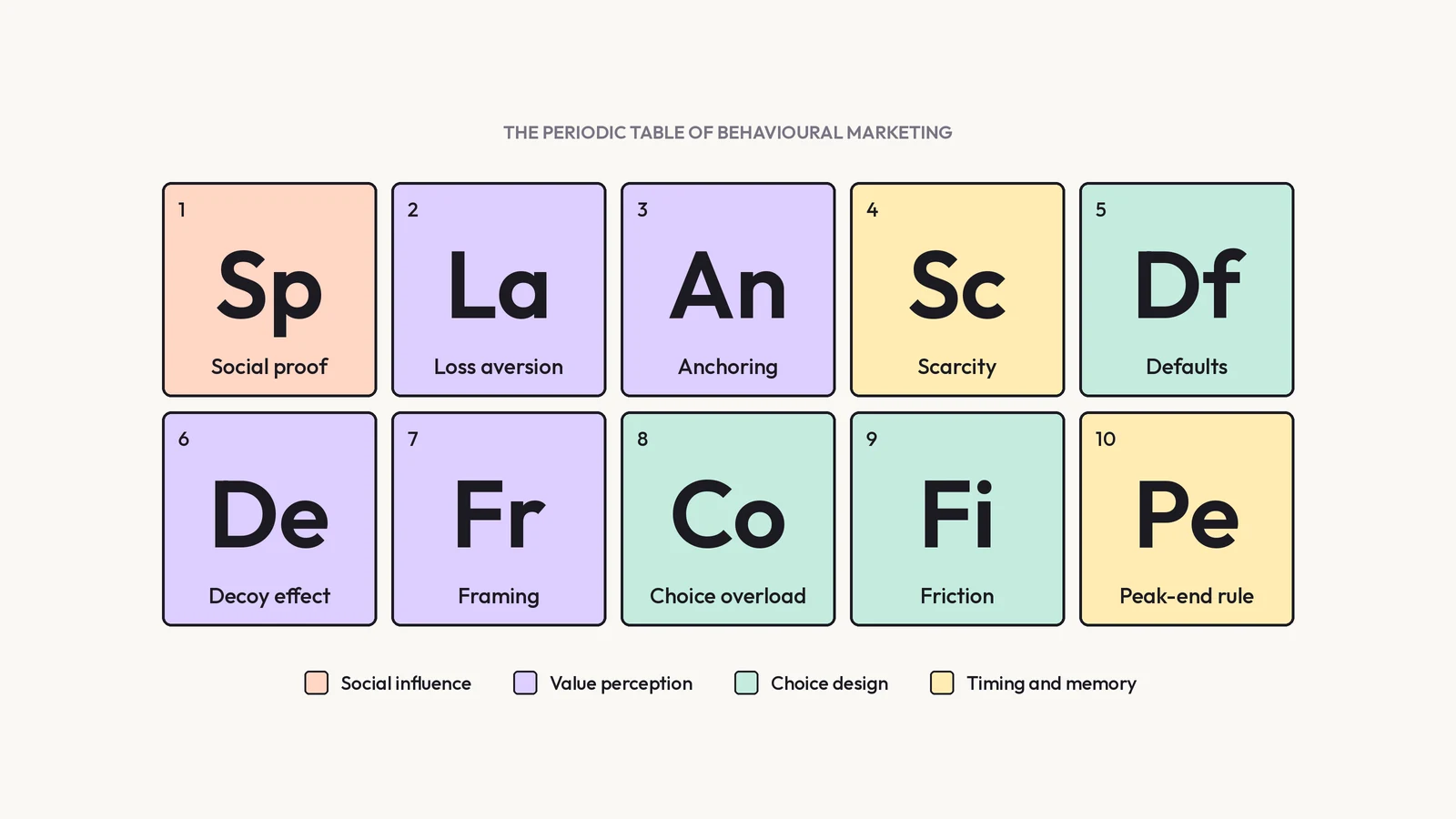
- Ten principles, from social proof to the peak-end rule, apply across ads, websites, pricing, checkout and email.
- The EAST framework (Easy, Attractive, Social, Timely) turns these ideas into a practical checklist.
- The line between a nudge and a dark pattern matters. In the UK, fake reviews and drip pricing are now banned.
- Treat every principle as a hypothesis and test it with real customers before rolling it out.
What is behavioural science in marketing?
Behavioural science is the study of how people think, decide and act, drawing on psychology, behavioural economics and sociology. In marketing, it is applied to one practical question: what makes it more or less likely that someone will notice, choose, buy or return?
Much of the field builds on the work of psychologists Daniel Kahneman and Amos Tversky, who showed that human judgement follows predictable patterns rather than pure logic. Kahneman later popularised the idea of two modes of thinking:
- System 1: fast, automatic and intuitive. It handles most everyday decisions, from which link to click to which brand to pick from a shelf.
- System 2: slow, deliberate and effortful. It is used for complex choices, and people avoid it when they can.
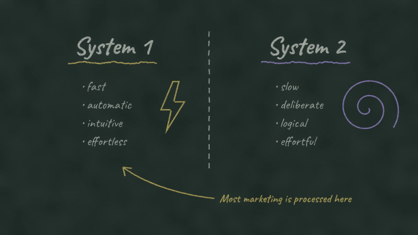
Most marketing is processed by System 1. People skim, scroll and decide in seconds. Behavioural science helps marketers design for that reality rather than for an imaginary customer who reads every word and compares every option.
The ideas reached a wider audience through the book Nudge by Richard Thaler and Cass Sunstein in 2008. In 2010 the UK government set up the Behavioural Insights Team, often called the Nudge Unit, to apply these ideas to public policy. Many of the best-documented examples of behavioural science in action come from its work.
Why behavioural science matters for marketers
- Small changes can have large effects. Rewording a sentence, changing a default or reordering options often shifts behaviour more than a bigger budget does.
- It explains the why behind the data. Analytics show where people drop off. Behavioural science helps explain why, which makes conversion rate optimisation far more targeted.
- It works across every channel. The same principles apply to ads, landing pages, emails, social content, pricing and onboarding.
- It lasts. Platforms and algorithms change constantly. The way people make decisions does not.
Even as more buyers begin their research in AI tools, a shift we explore in our guide to generative engine optimisation, the final decision is still made by a person, on a website or in an app, with the same mental shortcuts as before.
10 behavioural science principles every marketer should know
1. Social proof
People look to others to decide what to do, especially when they are uncertain. Reviews, ratings, customer numbers and visible popularity all reduce the perceived risk of a choice, which is why social proof is one of the most widely used principles in marketing.
One of the clearest examples comes from the UK tax authority. In a trial with the Behavioural Insights Team, letters telling late payers that most people in their area had already paid their tax increased payment rates by up to 15 percentage points compared with a standard letter, according to the Behavioural Insights Team report.
In practice: show genuine reviews near the point of decision, use specific numbers rather than vague claims, feature user-generated content and highlight what similar customers chose. Social proof works best when the reader can identify with the group mentioned.
2. Loss aversion
People feel losses more strongly than equivalent gains. Classic estimates suggest a loss feels roughly twice as powerful as a gain of the same size, which is why avoiding a loss often motivates more than achieving a benefit.
In practice: frame benefits in terms of what customers keep or avoid losing where it is honest to do so, such as money wasted on an inefficient process. Free trials that give full access and then ask users to keep what they have are a common application. Avoid inventing losses that do not exist.
3. Anchoring
The first number people see shapes how they judge every number that follows. In Tversky and Kahneman’s research, even an obviously random number influenced people’s later estimates.
In practice: the order in which prices appear matters. Showing a premium option first makes the mid-range option feel reasonable, and a clear original price makes a genuine discount easier to understand. Anchors must be real: inflated reference prices can breach consumer law.
4. Scarcity and urgency
People value things more when they seem limited or about to disappear. Scarcity signals popularity and prompts people to decide now rather than later.
In practice: use scarcity only when it is true, such as limited stock, a real deadline or a capped number of places. Fake countdown timers and false low-stock warnings damage trust and attract regulatory attention.
5. Defaults
People tend to stick with the pre-selected option. Changing the default is one of the most powerful interventions in behavioural science because it requires no effort from the person at all.
When the UK introduced automatic enrolment into workplace pensions from 2012, making saving the default rather than an opt-in choice, participation among private sector employees rose from 32% in 2012 to 75% in 2021, according to the Institute for Fiscal Studies.
In practice: choose defaults that serve the customer, such as the most popular plan, sensible notification settings or the delivery option most people want. Pre-ticked boxes for add-ons or marketing consent are not acceptable and are restricted by law.
6. The decoy effect
Adding a third option that is clearly worse than one of the others makes that option look more attractive. Researchers call this asymmetric dominance, first described in a 1982 study by Joel Huber, John Payne and Christopher Puto.
Imagine two plans: Basic at £10 and Pro at £25. Many people choose Basic. Add a Plus plan at £22 with fewer features than Pro, and Pro suddenly looks like the obvious choice. Plus is rarely chosen, but it changes how the other options are judged.
In practice: when designing pricing tiers, think about how each option frames the others. The goal is to make the best-value option easy to recognise, not to trick people into paying more than they need.
7. Framing
The same information can lead to different decisions depending on how it is presented. “95% success rate” and “5% failure rate” describe the same thing but feel very different.
In practice: test different frames for the same fact in headlines, product descriptions and ads. Present prices in the unit that makes most sense to the buyer, such as per month or per user, and keep every frame accurate.
8. Choice overload
Too many options can make it harder to choose, and sometimes lead people not to choose at all. A famous study found that shoppers were more likely to buy jam when offered six flavours than when offered 24.
The effect is real but not universal. Later research found it depends on the situation, such as how complex the options are and how clear the buyer’s preferences are. Fewer options are not always better, but clearer options almost always are.
In practice: limit plans to a manageable number, highlight a recommended option, use filters and sensible categories and remove options nobody chooses.
9. Friction
Every extra step, field or moment of uncertainty reduces the chance that someone completes an action. Friction is often invisible to the business and obvious to the customer.
In practice: remove unnecessary form fields, allow guest checkout, show total costs early and make the next step obvious with a clear call to action. Friction can also be used positively, for example by adding a confirmation step before an action that is hard to reverse.
10. The peak-end rule
People judge an experience mainly by its most intense moment and by how it ends, rather than by the average of every moment. A smooth ending can redeem a slow process, and a frustrating ending can spoil a good one.
In practice: pay special attention to the final steps of the journey: the confirmation page, the delivery experience, the first email after purchase and the cancellation process. These moments shape what customers remember and what they tell others.
Behavioural principles at a glance
| Principle | What it means | Digital example |
|---|---|---|
| Social proof | People follow what others do | Reviews and ratings next to the buy button |
| Loss aversion | Losses feel stronger than gains | A trial that shows what the user will lose access to |
| Anchoring | The first number shapes judgement | Showing the premium plan first on a pricing page |
| Scarcity | Limited things feel more valuable | Genuine low-stock or deadline messages |
| Defaults | People keep the pre-selected option | The most popular plan selected by default |
| Decoy effect | A weaker option makes another look better | A three-tier pricing table |
| Framing | Presentation changes perception | Price shown per month rather than per year |
| Choice overload | Too many options stall decisions | A recommended option among fewer plans |
| Friction | Every extra step loses people | Guest checkout and shorter forms |
| Peak-end rule | Peaks and endings shape memory | A helpful confirmation page and follow-up email |
A simple framework: EAST
The Behavioural Insights Team summarises its approach in the EAST framework. It is one of the most practical ways to turn behavioural science into marketing decisions. If you want people to do something, make it:
- Easy: remove steps, simplify language and set helpful defaults.
- Attractive: draw attention with relevant, personal and visually clear messages, and make the benefit obvious.
- Social: show what other people do and use the influence of trusted voices.
- Timely: reach people when they are most open to change, such as at the start of a month, after a milestone or at the moment of need.
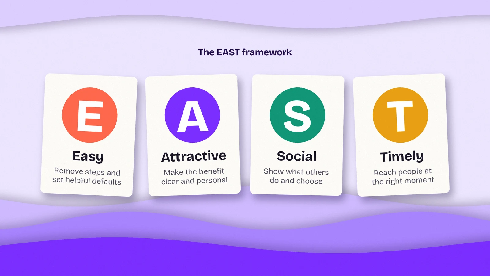
EAST works well as a checklist. Before launching a campaign, a landing page or an email sequence, ask whether the desired action is easy, attractive, social and timely. Most underperforming journeys fail on at least one of the four.
Applying behavioural science across the customer journey
Each stage of the buyer’s journey has its own barriers, so different principles help at different points.
| Stage | Common barrier | Principles that help |
|---|---|---|
| Awareness | The message is ignored | Framing, attractive and timely messages |
| Consideration | Uncertainty and perceived risk | Social proof, clear comparisons, fewer choices |
| Decision | Hesitation over price or commitment | Anchoring, decoy effect, loss aversion, defaults |
| Purchase | Effort and surprises at checkout | Reduced friction, clear total costs |
| Retention | Weak memory of the experience | Peak-end rule, timely follow-up |
On a landing page, this might mean a clear headline framed around the customer’s problem, reviews close to the call to action and a short form. In email marketing, it might mean sending at the right moment, using a familiar sender name and making the next step a single click. Good user experience design applies many of these principles without naming them.
Nudges vs dark patterns: where the ethical line sits
Every principle in this guide can be used to help people or to exploit them. A nudge makes a good choice easier. A dark pattern pushes people towards a choice that benefits the business at their expense, often by hiding information or creating false pressure.
| Helpful nudge | Dark pattern |
|---|---|
| Highlighting the most popular plan | Hiding the cheapest plan |
| A real deadline for an offer | A countdown timer that resets on reload |
| Genuine customer reviews | Fake or selectively filtered reviews |
| Showing the full price upfront | Adding mandatory fees at checkout |
| An easy way to cancel | A cancellation process designed to wear people down |
This is no longer only an ethical question. The UK Competition and Markets Authority has published research on how online choice architecture can harm consumers. Since 6 April 2025, under the Digital Markets, Competition and Consumers Act 2024, the CMA can enforce consumer law directly and fine businesses up to 10% of global turnover. Fake reviews and drip pricing, where mandatory fees are added late in the buying process, are now explicitly banned.
A simple test helps: would you be comfortable explaining the design choice to the customer it affects? If the tactic only works because people do not notice it, it is probably a dark pattern.
The limits of behavioural science
Behavioural science is powerful, but it is not a set of guaranteed tricks. Some well-known findings have proved weaker or more context-dependent when researchers tried to replicate them, and results from a university laboratory rarely transfer one to one to a real website.
The same principle can work in one market and fail in another. Audiences, products and cultures differ, and a message that builds trust in one context can feel pushy in another. Treat each principle as a hypothesis, then test it with A/B testing and real customer data before rolling it out.
How to start using behavioural science in your marketing
- Map the journey. Write down every step a customer takes, from first contact to repeat purchase.
- Find where people drop off. Use analytics, heatmaps, session recordings and customer feedback to locate the points where behaviour stalls.
- Diagnose the barrier. Ask what is stopping people: too much effort, too much uncertainty, too many options or the wrong moment.
- Choose one principle and one change. Match the barrier to a principle and design a single, specific change.
- Test and measure. Compare the change against the original and judge it by the conversion rate and longer-term signals such as refunds, complaints and repeat purchases.
- Check the ethics. Keep only the changes you would be happy to explain to your customers.
Frequently asked questions
What is behavioural science in marketing?
Behavioural science in marketing is the use of research into how people really make decisions to design better messages, websites, prices and customer journeys. It draws on psychology, behavioural economics and sociology to explain why people choose, buy and return.
What is the difference between behavioural science and behavioural economics?
Behavioural economics is one part of behavioural science. It focuses on economic decisions such as spending, saving and pricing, while behavioural science is broader and also covers psychology, social influence and habits.
What are some examples of behavioural science in marketing?
Common examples include customer reviews next to a buy button (social proof), a recommended plan on a pricing page (defaults and the decoy effect), genuine limited-time offers (scarcity) and shorter checkout forms (reduced friction).
Is using behavioural science in marketing ethical?
It is ethical when it helps people make choices that are good for them and remains transparent. It becomes unethical when it relies on hidden information or false pressure, which are known as dark patterns. In the UK, practices such as fake reviews and drip pricing are now banned.
What is a nudge in marketing?
A nudge is a small change in how a choice is presented that makes a particular action easier or more likely, without removing any options. Examples include a sensible default setting, a timely reminder or a clear recommendation.
Design for how people really decide
Kutola reviews websites, campaigns and customer journeys through a behavioural lens, finding where people hesitate and what would help them move forward. Get in touch to see where your journey loses customers.