How to build a brand identity people remember
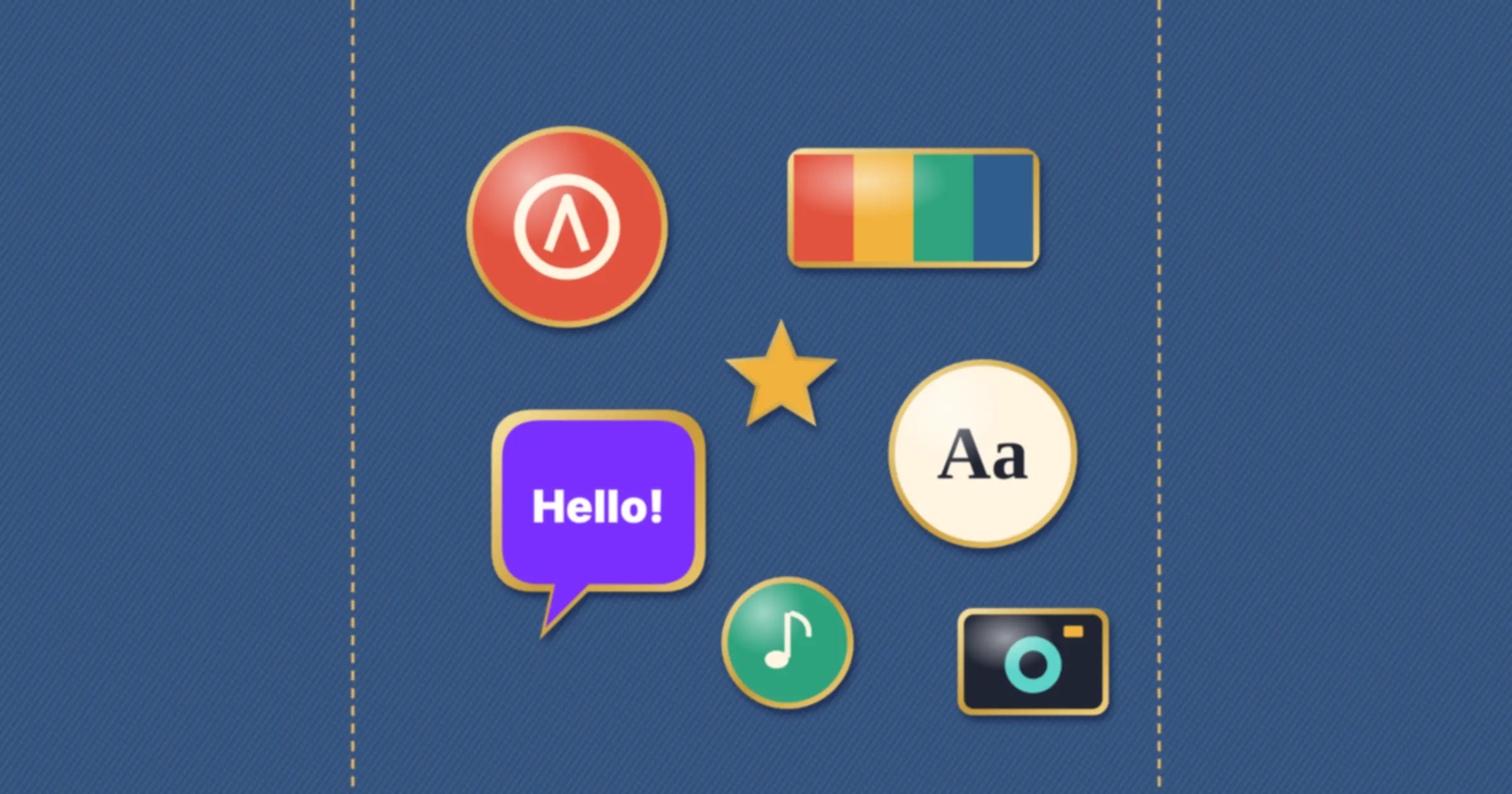
Brand identity is the set of visible and verbal elements a business uses to present itself: its name, logo, colours, typefaces, imagery, tone of voice and any other cues people come to recognise, such as a shape, sound or phrase. A strong identity does two jobs. It expresses what the brand stands for, and it makes the brand easy to recognise and remember everywhere it appears.
Identity is how a brand strategy becomes something people can see and hear. This guide explains how brand identity differs from brand image and strategy, the elements it includes, what makes an identity memorable, how to create one in seven steps, how to do it on a small budget and when a refresh makes sense.
What is brand identity?
Brand identity is everything a business deliberately chooses to show and say so that people recognise it. It is the part of the brand the business controls directly, unlike reputation, which lives in customers’ heads.
A useful way to think about it is as a toolkit. The strategy decides what the brand should mean. The identity provides the tools, such as a logo, a colour, a typeface and a way of writing, that carry that meaning into every website, invoice, van, social post and email. Without the strategy, the tools have nothing to say. Without the tools, the strategy stays on paper.
Brand identity vs brand image vs brand strategy
| Term | What it is | Who controls it |
|---|---|---|
| Brand strategy | The plan for what the brand should mean and to whom: purpose, audience, position and personality | The business |
| Brand identity | The elements that express the strategy: name, logo, colours, type, imagery, voice and distinctive assets | The business |
| Brand image | What people actually think and feel about the brand, based on everything they have seen and experienced | Customers and the public |
| Brand guidelines | The rules and examples that show people how to use the identity consistently | The business |
The aim is to close the gap between identity and image, so that what people think of you matches what you intended. Identity helps, but product quality, service and what others say about you shape image just as much.
The elements of brand identity
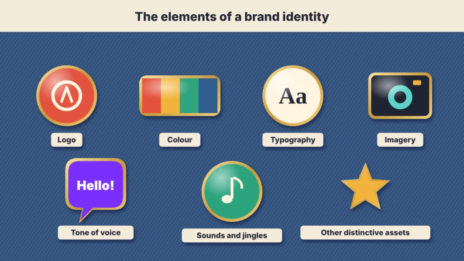
Name
The name is the most used and longest-lasting element. It should be easy to say, spell and remember, available as a domain and on social platforms and legally clear to use. Check the UK Intellectual Property Office’s trade mark register and Companies House before committing.
Logo
A logo is a shorthand for the brand, not a summary of everything it does. It needs to work small, in one colour and on dark and light backgrounds. Most businesses need a main version, a compact or icon version and clear rules on spacing and minimum size.
Colour
Colour is often the fastest cue people use to recognise a brand. Choose a small palette with one or two lead colours, and check that text and background combinations meet accessibility contrast standards. The Web Content Accessibility Guidelines set a contrast ratio of at least 4.5:1 for normal body text.
Typography
Typefaces carry personality: a geometric sans serif feels modern and clean, a serif can feel established, a rounded face can feel friendly. One or two families are usually enough, with fallbacks for email and documents. Check the licence covers web, print and app use.
Imagery and graphic elements
Photography style, illustration, icons, patterns and layouts all become part of the identity when they are used consistently. A specific way of cropping, a colour treatment or a recurring shape can be as recognisable as a logo.
Tone of voice
How a brand writes and speaks is part of its identity, not an afterthought. Three or four voice traits, each with what it means and does not mean, keep copy consistent across the website, emails, social posts and customer service.
Other distinctive assets
Sounds, jingles, characters, packaging shapes, slogans and even a recurring phrase in customer emails can all become identity elements if people learn to link them with you.
What makes a brand identity memorable
Recognition comes from distinctiveness and consistency more than from cleverness. Jenni Romaniuk of the Ehrenberg-Bass Institute, in her book Building Distinctive Brand Assets, measures identity elements on two dimensions:
- Fame: how many people in your category link the element with your brand.
- Uniqueness: how few people link it with competitors.
An element that scores high on both, such as a signature colour or shape that only you use, is a distinctive asset worth protecting and using everywhere. One that is famous but shared with competitors, such as green for an eco brand, does little to set you apart. Most new elements start low on both, and only become assets through years of consistent use.
That has two practical lessons. First, choose elements that are different from your category’s norms, not ones that copy the market leader. Second, once you have chosen, use them consistently for a long time. Changing colours or logos every few years throws away the recognition you have built.
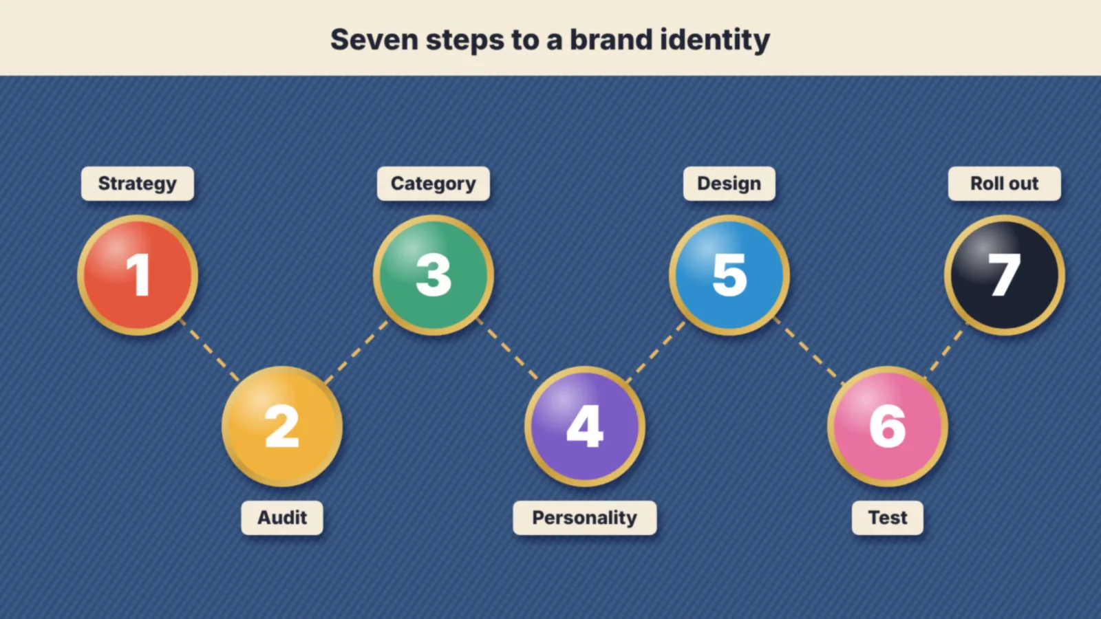
How to create a brand identity in 7 steps
- Start from the strategy. Confirm your purpose, audience, positioning and personality. If these are unclear, work on them first, because they are the brief for every design decision.
- Audit what you have. Collect every place the brand appears, from signage and vans to the website, social profiles and invoices. Note what people already recognise and what is inconsistent.
- Study the category. Lay out competitors’ logos, colours and messages side by side. Look for the conventions everyone follows, then decide where to fit in for clarity and where to stand out.
- Define the personality in words. Agree three or four adjectives the identity must express, and a few it must avoid. This turns design feedback from “I don’t like it” into “it feels too corporate for us”.
- Design the core elements. Develop the logo, palette, typefaces, image style and voice together, testing them on real applications such as a homepage, social post, invoice and van rather than on a blank page.
- Test with real people. Show options to customers and prospects. Ask what each suggests about the business and whether it stands out from competitors, rather than which one they like.
- Document and roll out. Write brand guidelines with clear examples, build templates for the things people make most often and update every touchpoint in a planned order.
Brand identity examples
- Monzo. The bank’s hot coral card made a physical object its main identity asset. The colour made the card easy to spot across a room and carried into the app and marketing.
- Oatly. Hand-drawn lettering and long, chatty, self-aware copy on the packaging make the voice as recognisable as the logo. The identity works even when the brand name is barely visible.
- GOV.UK. A single typeface, a plain black and white layout and strict writing rules give hundreds of government services one recognisable identity, built for clarity rather than decoration.
- Cadbury. A particular shade of purple has been linked with the brand for so long that many people recognise its chocolate from the wrapper colour alone.
Each one chose a small number of elements and used them relentlessly. None relies on the logo alone.
Brand identity on a small budget
A small business does not need a large agency project to have a strong identity. It needs a few good decisions applied consistently.
- Prioritise. A clear name, a simple logo, two colours, one typeface and a short tone of voice guide cover most needs.
- Invest in the logo and templates. Pay a professional designer for the core elements and a set of templates, then produce everyday materials in-house.
- Use free, well-made type. Open-source families such as those on Google Fonts are licensed for commercial use and work across web and print.
- Apply it everywhere at once. Update the website, social profiles, email signature, invoices and signage together, so the new identity is seen consistently from day one.
When to refresh a brand identity
Refresh an identity when it no longer reflects the business, has become hard to use on modern channels or looks dated against competitors in a way that costs you customers. Mergers, a move into new markets or a significant change in offer are common triggers.
Move carefully. When Tropicana replaced its familiar orange-with-a-straw packaging in the US in 2009, sales reportedly fell by around a fifth within two months, and the company brought back the old design. Gap dropped a new logo within a week in 2010 after a public backlash. Both changes threw away assets customers relied on to find the product.
A safer approach is evolution: keep the elements people recognise, such as a colour or symbol, and modernise the rest. Test the change with customers before launch, and roll it out across every touchpoint in a planned sequence.
Common brand identity mistakes
- Starting with the logo. Without a strategy, design choices come down to personal taste.
- Copying the category leader. Looking like the biggest competitor makes you easier to mistake for them.
- Too many elements. Five colours, three typefaces and several logo versions dilute recognition.
- Changing too often. Recognition builds slowly and disappears quickly when elements keep changing.
- Forgetting the voice. A consistent look with inconsistent writing still feels like several different businesses.
- Ignoring accessibility. Low-contrast colours and tiny type exclude people and fail on small screens.
- Skipping legal checks. A name or logo too close to an existing trade mark can force an expensive change later.
Frequently asked questions
What is brand identity?
Brand identity is the set of elements a business uses to present itself and be recognised, including its name, logo, colours, typefaces, imagery and tone of voice. It expresses the brand strategy in a form people can see and hear.
What is the difference between brand identity and brand image?
Brand identity is what the business creates and controls: its name, logo, colours and voice. Brand image is what people actually think and feel about the brand, shaped by the identity but also by products, service and reputation.
What are the main elements of brand identity?
The main elements are the name, logo, colour palette, typography, imagery and tone of voice. Many brands also use distinctive assets such as a shape, sound, character or slogan that people learn to link with them.
How do you create a brand identity?
Start from your brand strategy, audit what you already use, study competitors, define the personality in words, design the core elements together, test them with customers and document everything in brand guidelines.
How much does a brand identity cost in the UK?
It ranges widely, from a few hundred pounds for a freelance logo to tens of thousands for an agency project with research, naming and full guidelines. Most small businesses get good value from a professional designer creating the core elements and templates.
On this page
Back to topBuild an identity people recognise at a glance
Kutola helps you decide what your brand should stand for and turn it into a clear, distinctive identity, from logo and colour to tone of voice and guidelines. See how it fits into our brand and digital experience work, or get in touch to talk through your brand.